
In most cases, signals are analyzed in multiple stacked plots with a synchronized X-axis. Signals of similar scale are often shown in the same plot. However, it can sometimes be clearer to display signals with different scales together in a single plot. Many data visualization tools therefore allow the use of multiple Y-axes. But displaying too many signals in one plot can quickly become confusing.
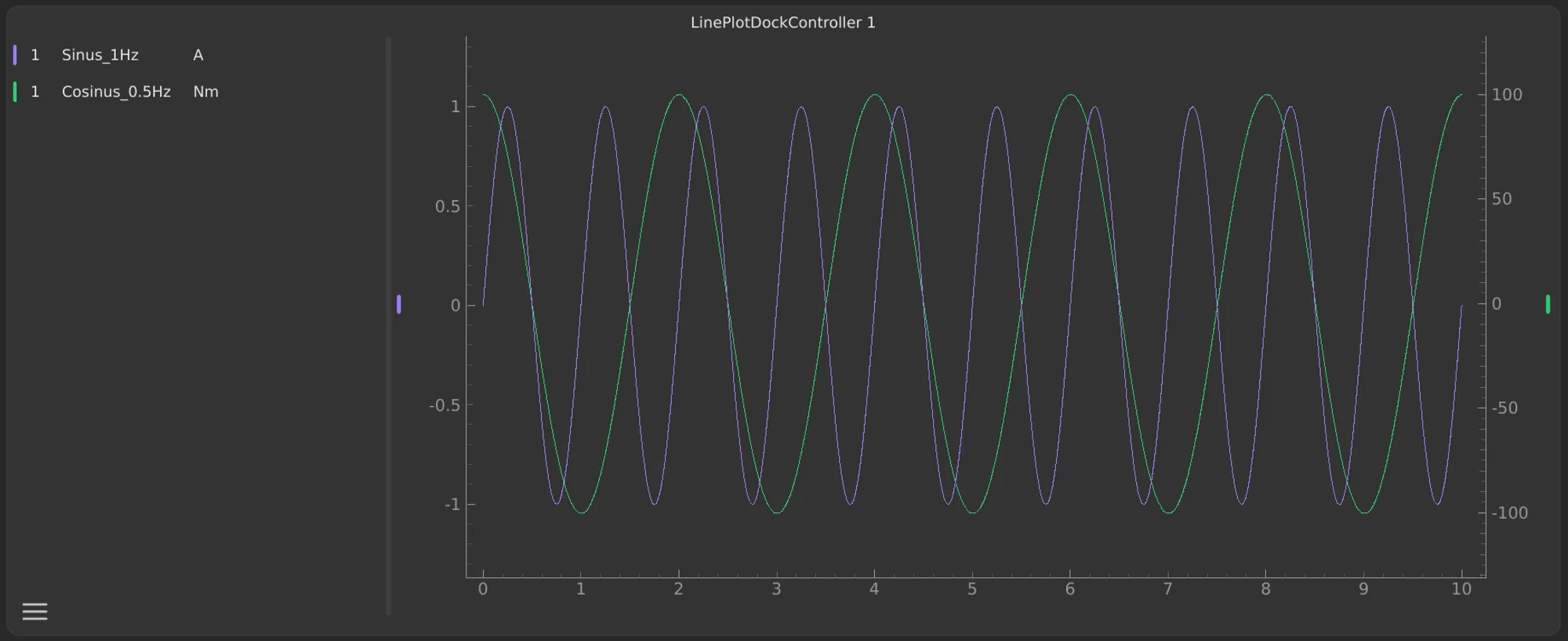
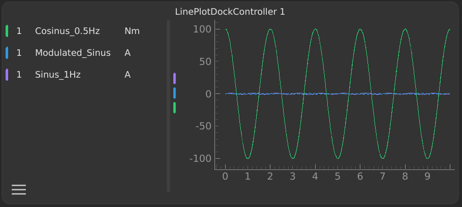
For ScryLab, we have deliberately chosen to allow a maximum of two Y-axes – one on the left and one on the right. This strikes a good balance between clarity and flexibility.
Avoiding Overload
Showing too many Y-axes in a plot can lead to visual overload. Constantly switching between signals and axis scales makes it harder to interpret the data – both for yourself and for anyone you share the plots with. That’s why we intentionally keep the left Y-axis as the main axis, while the right Y-axis only appears when needed. This keeps the plot clear and easy to read.
Subplots as a Flexible Solution
If you want to compare even more signals in a single view, you can use multiple subplots. These can be linked through a synchronized X-axis, allowing cross-plot comparisons without overcrowding a single plot.
Visual Mapping
By default, each signal is plotted on the left axis. If you move a signal to the right axis, this mapping is indicated with a colored marker on the corresponding axis. This makes it immediately clear which signals belong to which axis.
Intuitive Navigation
Even with a second Y-axis, navigation remains consistent: zooming and panning in the plot area always affect both axes equally, so the signals stay aligned. Independent axis adjustments can still be made using the controls on the axes themselves.
Conclusion
With this design, we aim to make complex measurement data easy to understand without adding unnecessary complexity. Instead of using unlimited axes, we rely on clearly defined structures, unambiguous visual mapping, and subplots as a useful complement.
We believe this approach provides a better data analysis experience – clear, intuitive, and practical for everyday use.